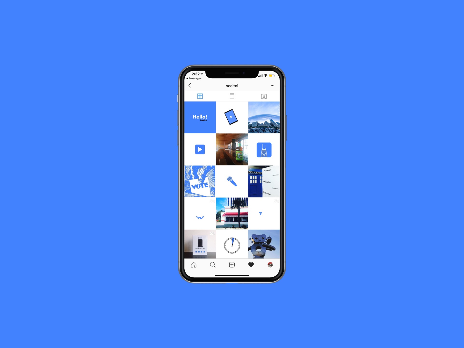
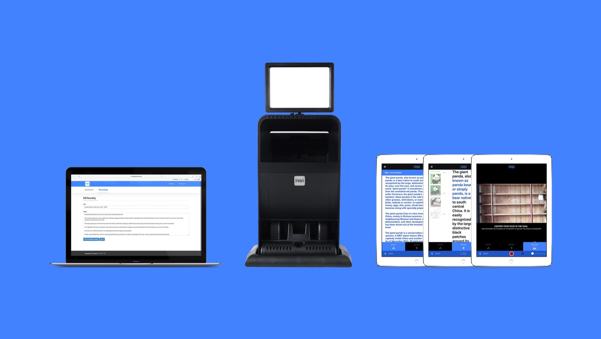
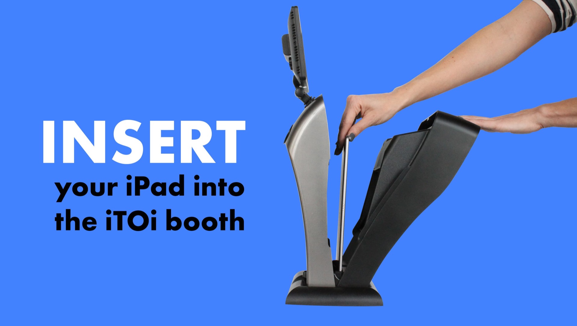
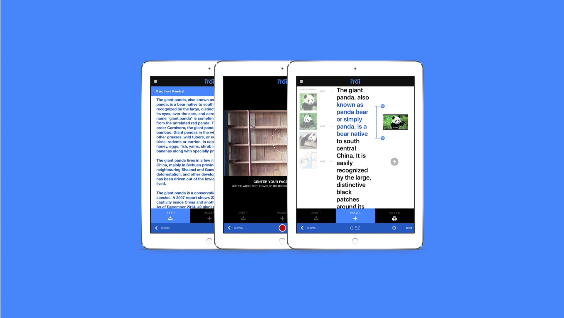
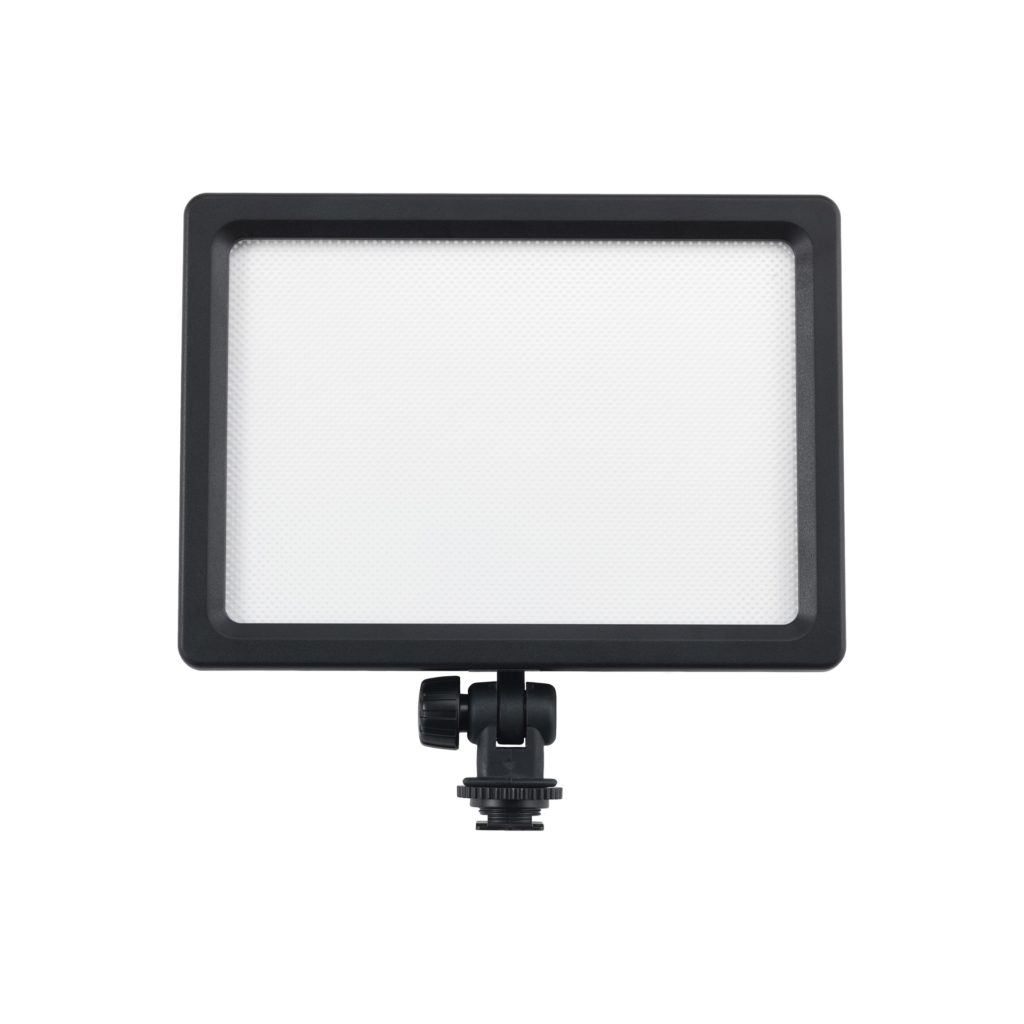
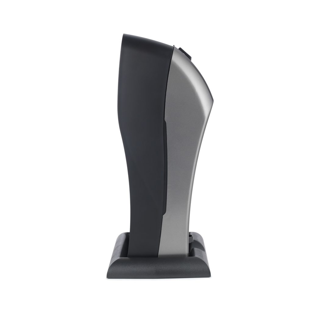
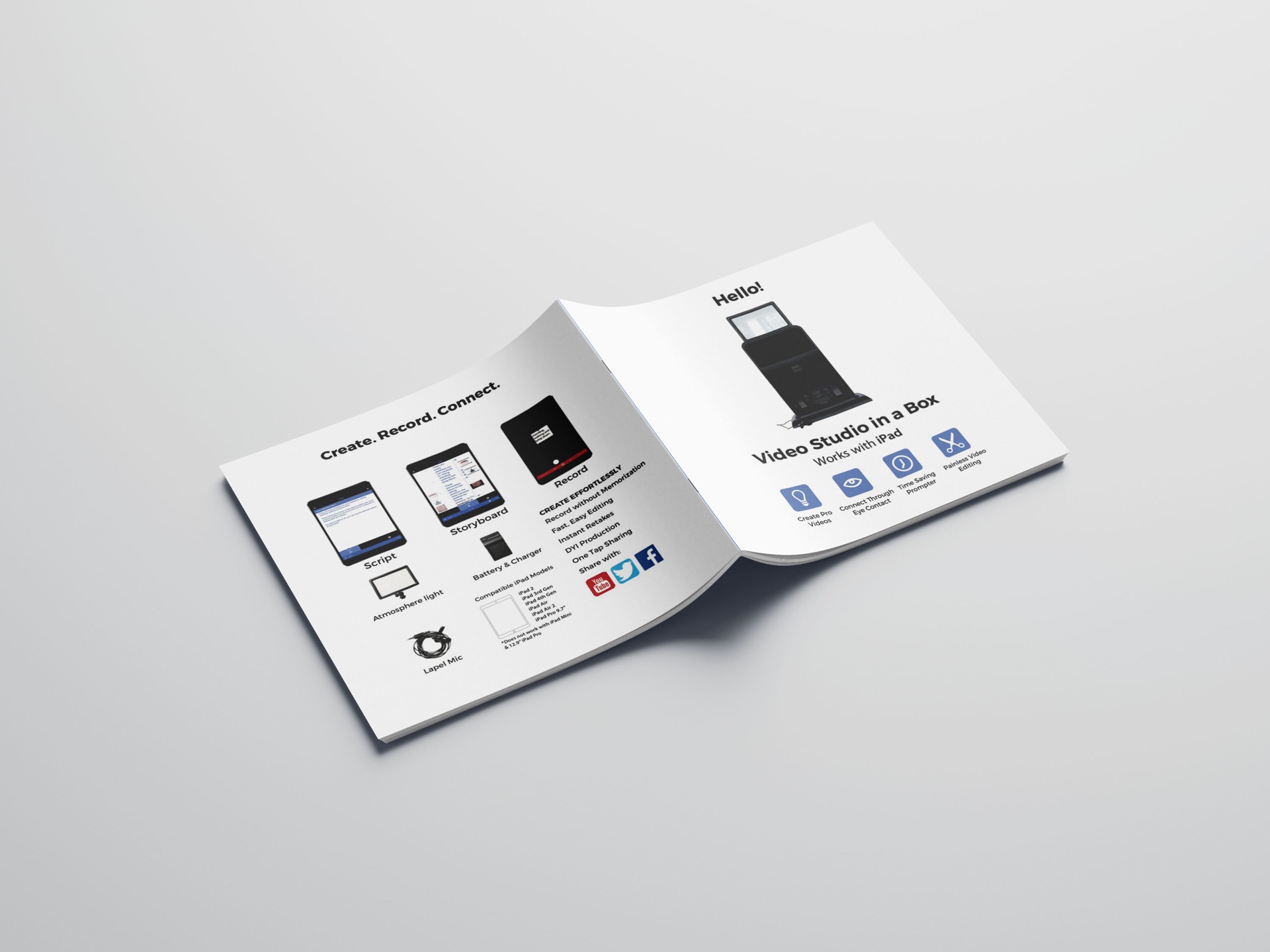
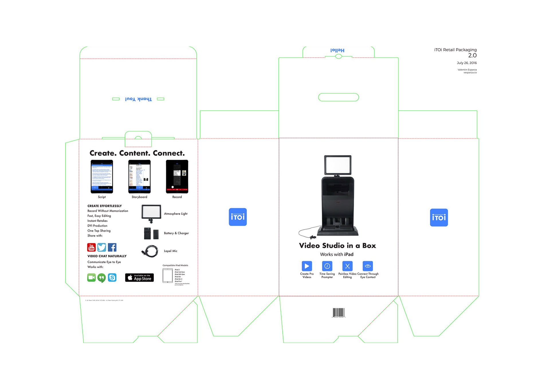
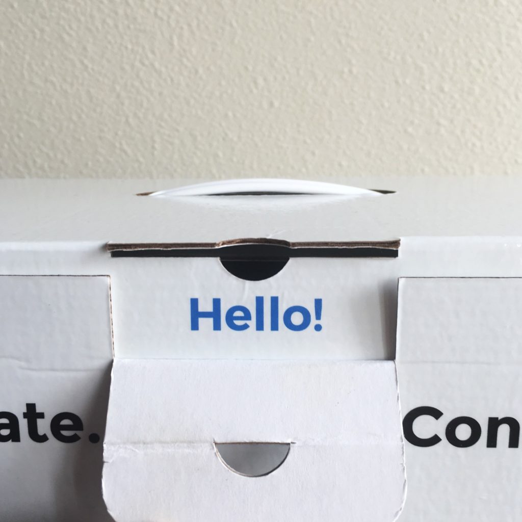
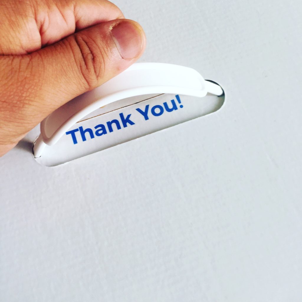
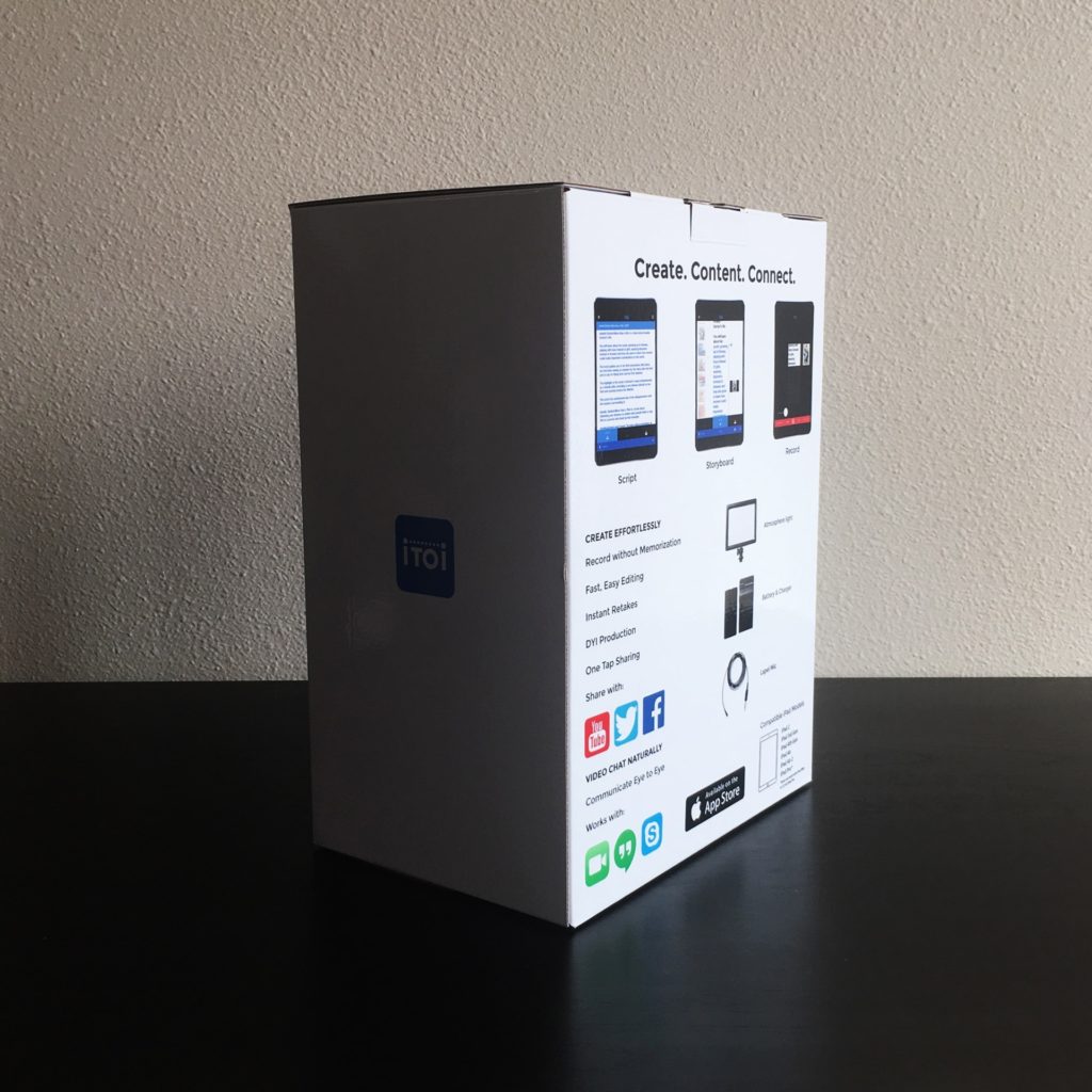
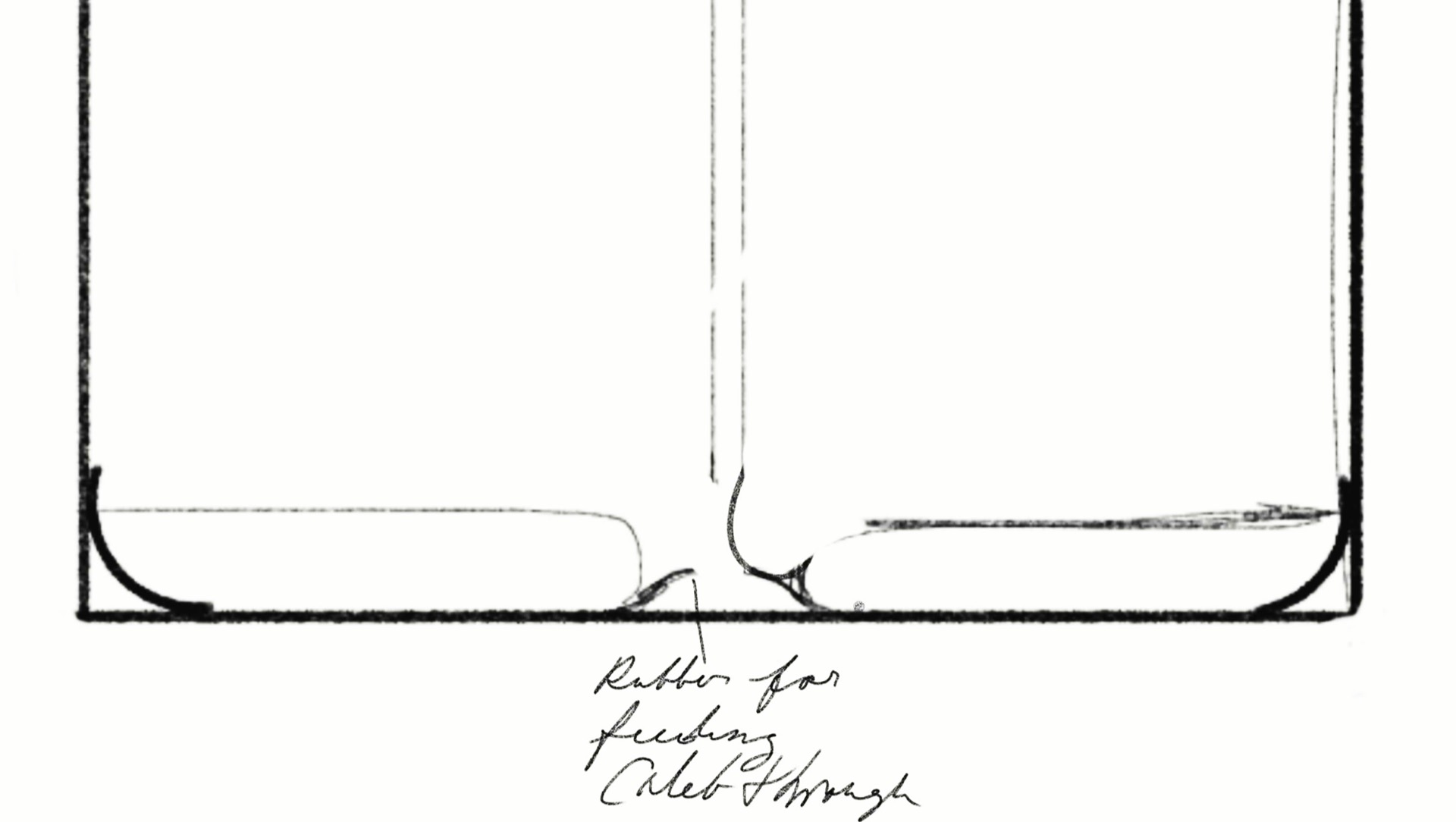
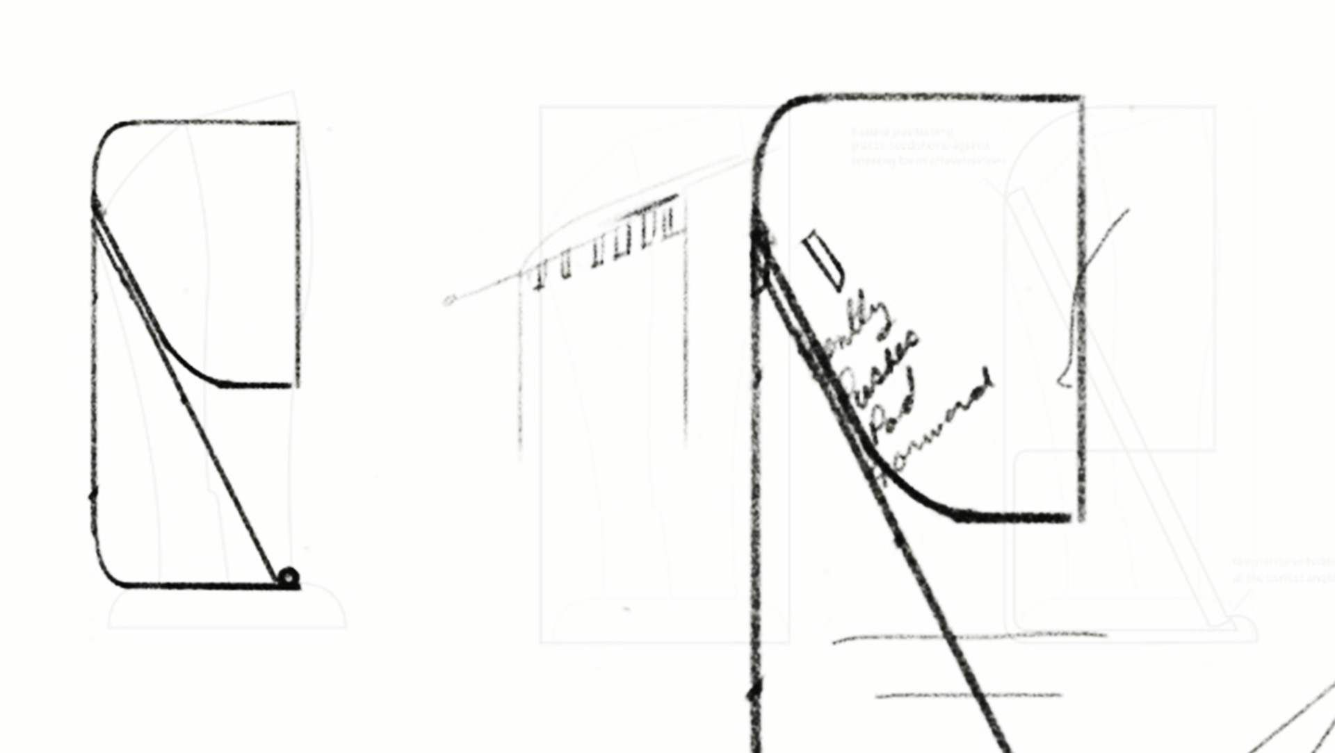
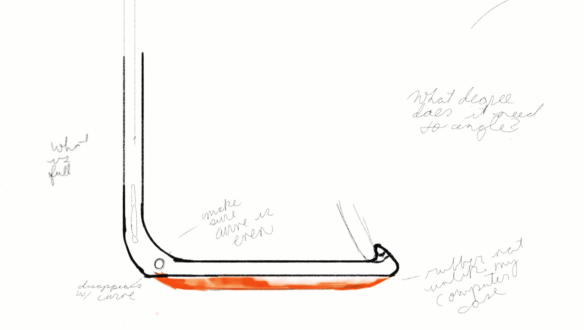
For 6 months, I worked on the iTOi (eye to eye) brand developing their startup’s voice in the digital video space. I started by pulling out the brand color and font, front and center. Big, Bold, and Bright. After that, I stripped their packaging, brochures, and presentations and put them on white to make the Blueberry Blue (#4b89f7) pop.
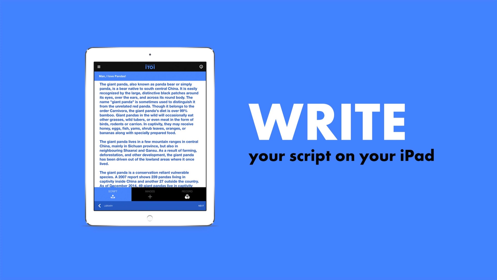
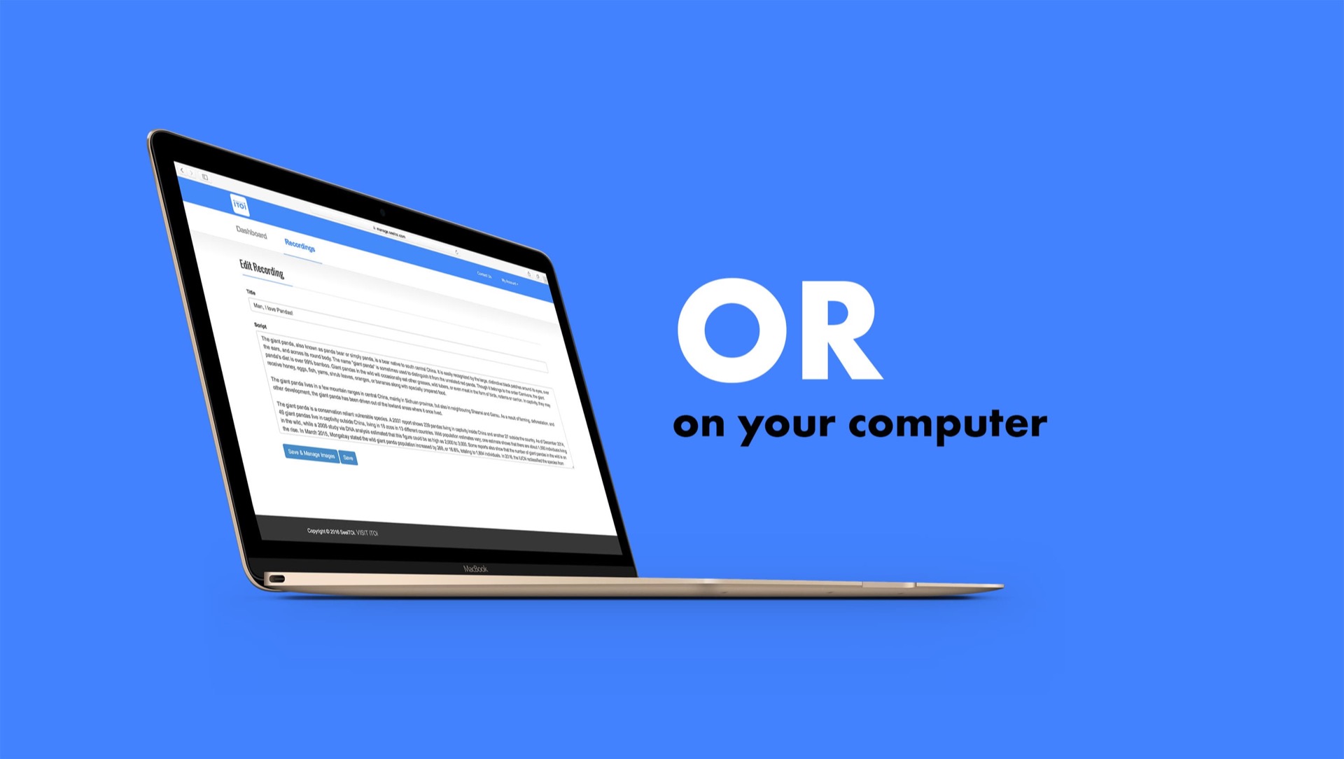
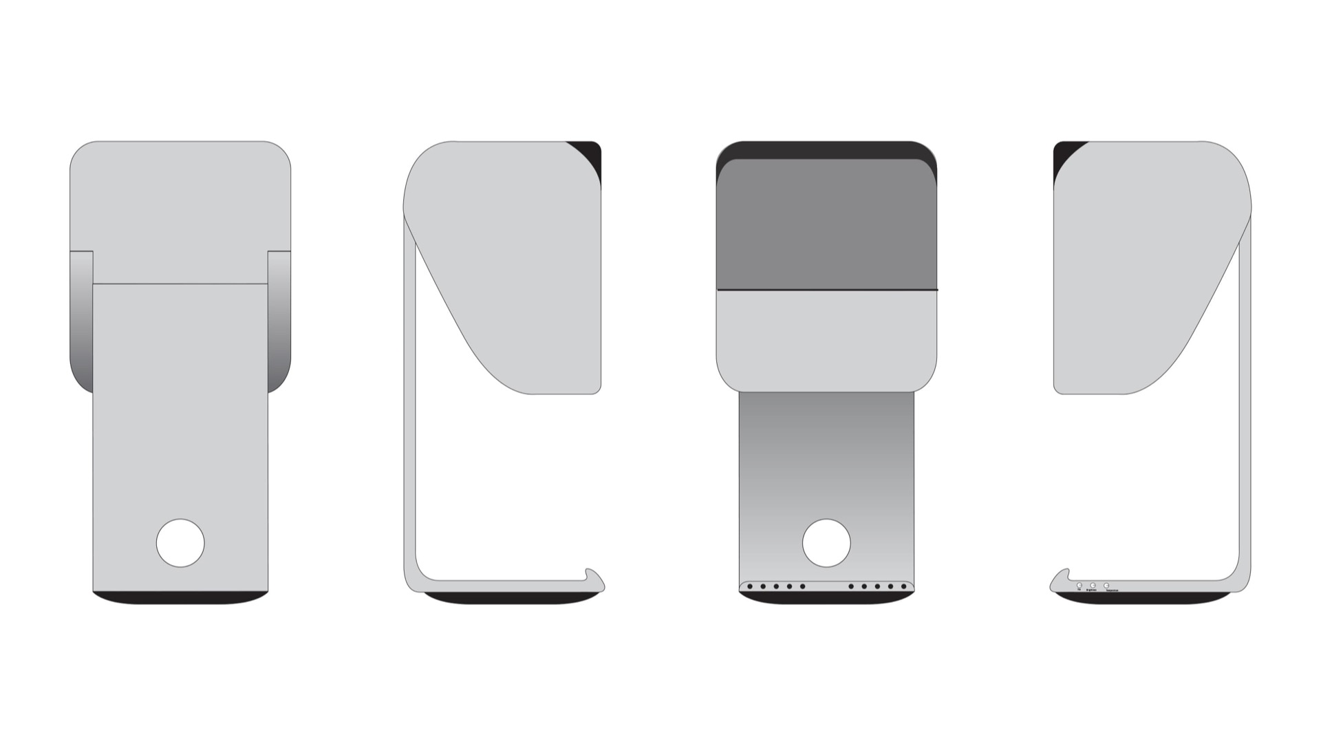
Then it was a process of simplifying the brand message across all forms. Icons were created, photography shoots scheduled, presentations written and packaging redesigned. Check out the work below.