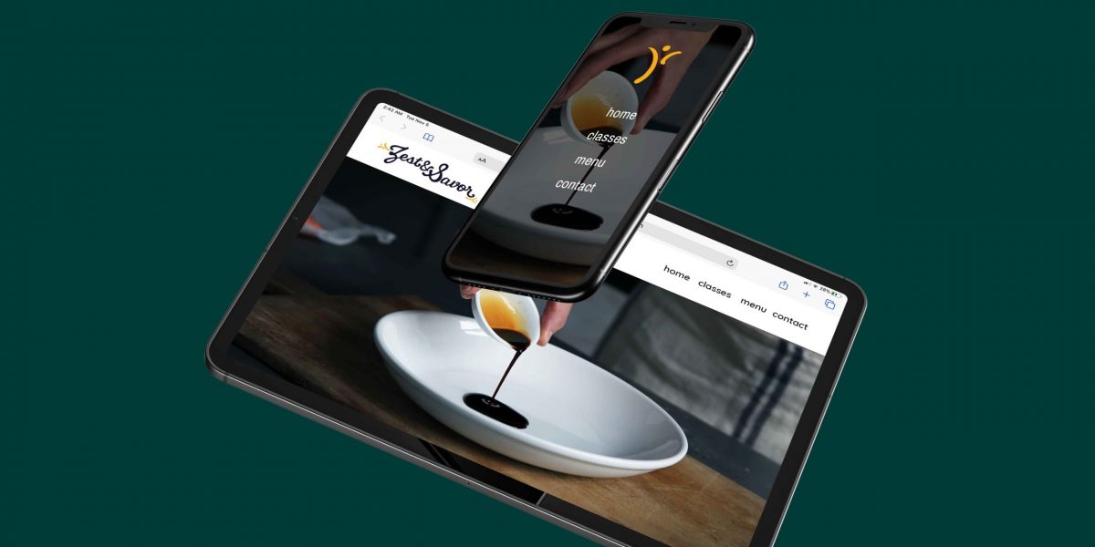
Zest & Savor
Brand Identity
This logo was inspired by my mom. She said that there’s always something extra when you’re cooking that gives the food it’s extra flavor – some call it love, she called it “sazon”. It’s that flick of the wrist, the turn at just the right moment, the perfect amount of salt, that je ne sais quoi. Some people practice for years to get their sazon. Some people are born with it. At the end of the day, it’s the magic in every dish.
The “Sazon” is embodied in the yellow mark that can be used in place for the logo, and easily drawn by hand to keep the brand ever changing and fresh. You won’t find a typeface in this section, the type was a custom creation just for this logo.
Most importantly, you can draw it with sauce.
Art Direction & Graphic Design
Valentin Esparza


Are we cookin' yet?


