FIG Medical Spa
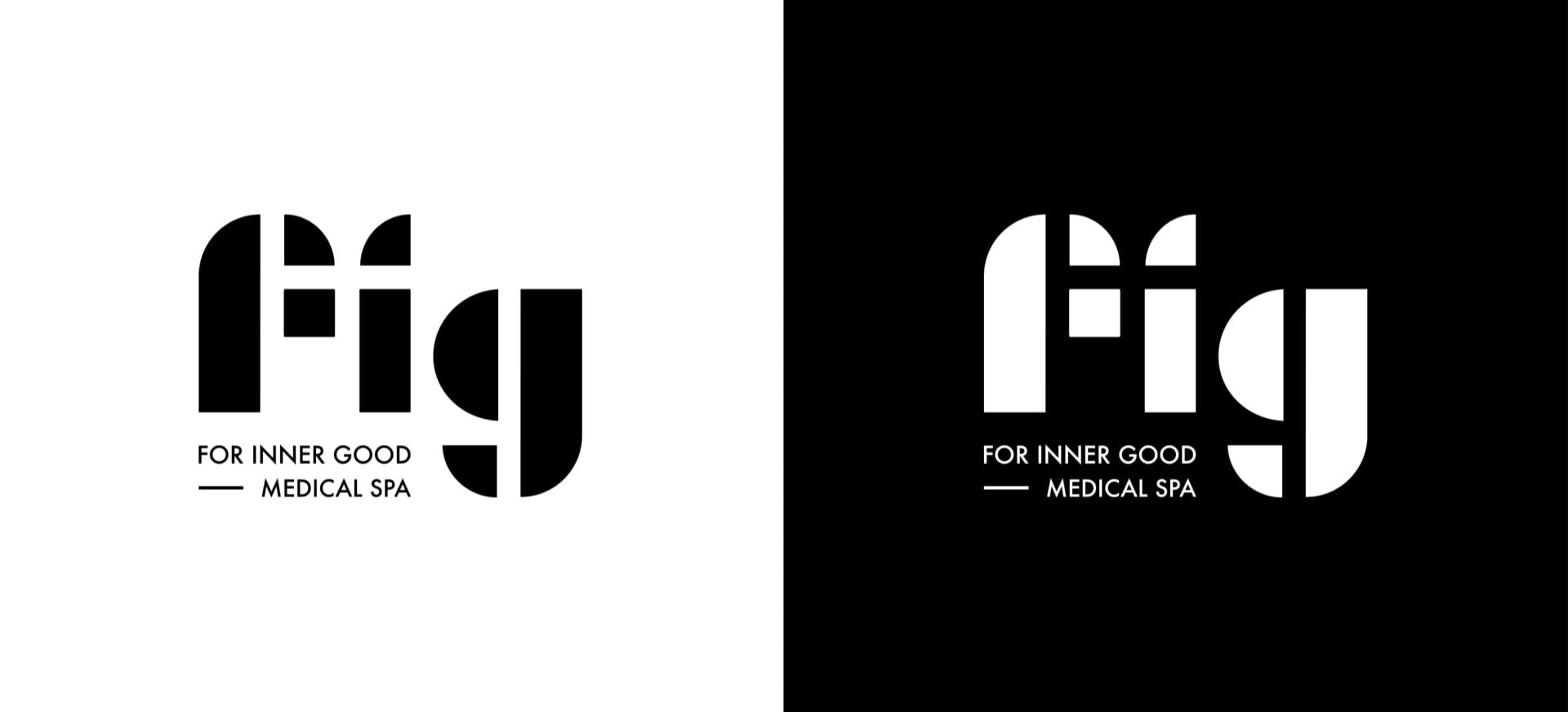
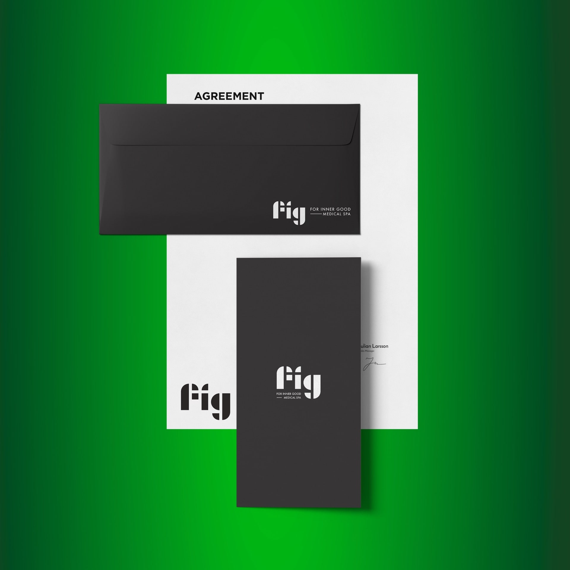
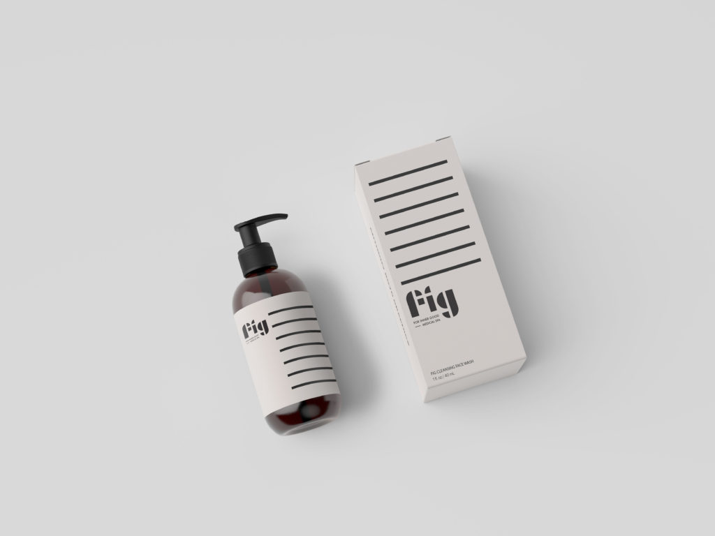
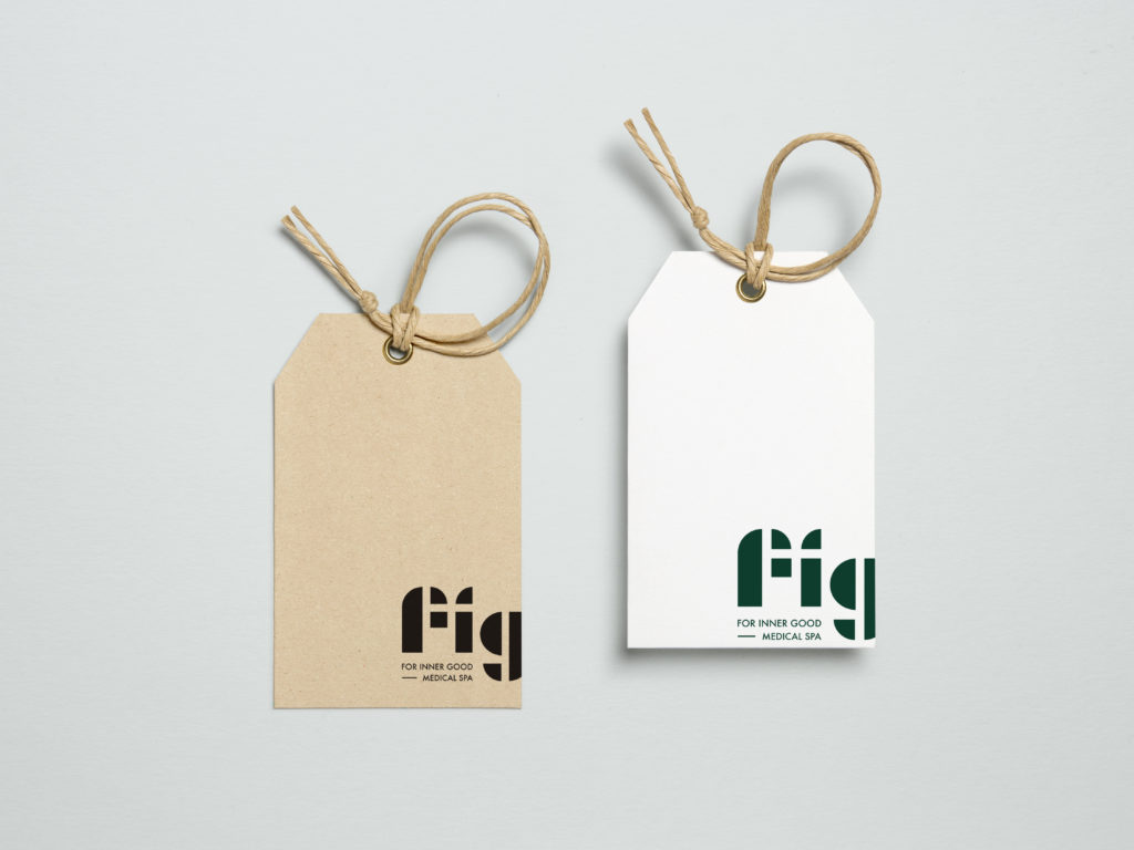
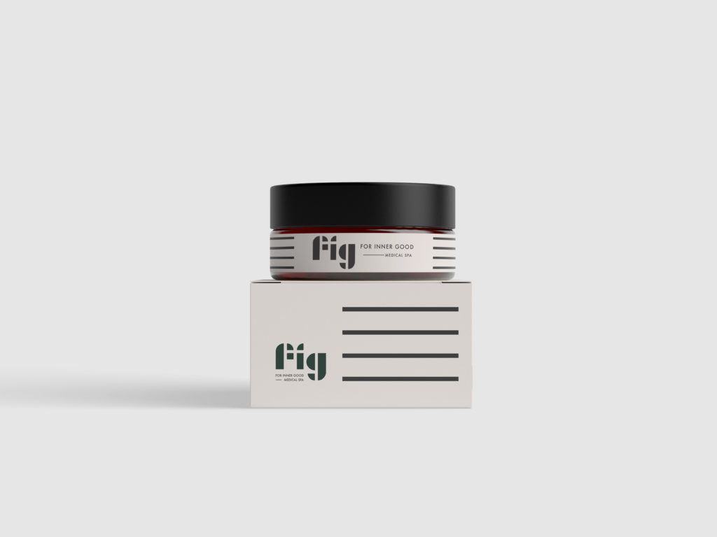
Fig is a medical spa with a different approach; They value long term regimens over short term fixes. This keeps their clients looking natural and healthy. Amy and Cristie came to me with a request for a brand identity that was clean, natural, and simple. My approach for this design was based on the concept of building blocks – a reflection of their ethos.
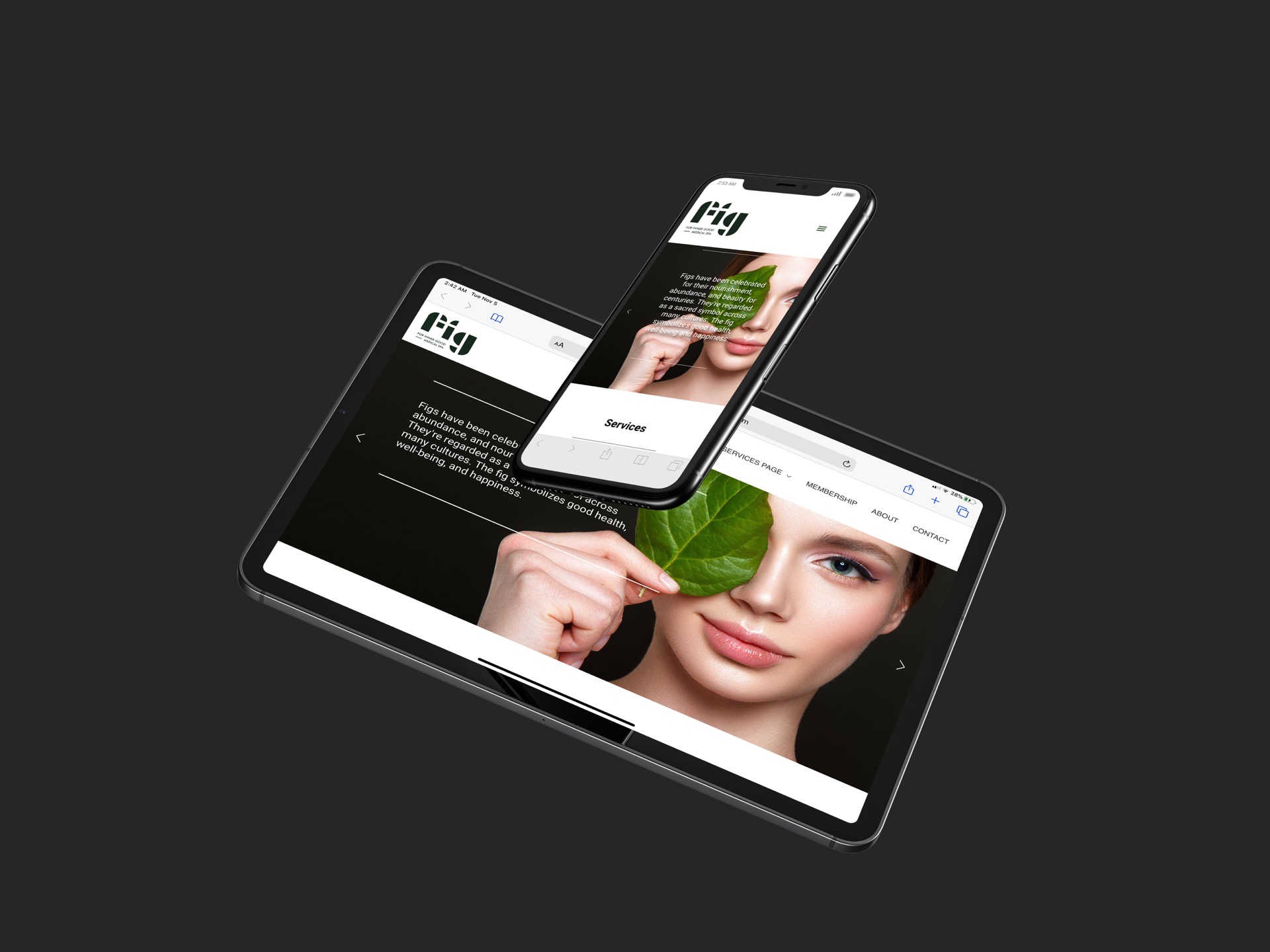
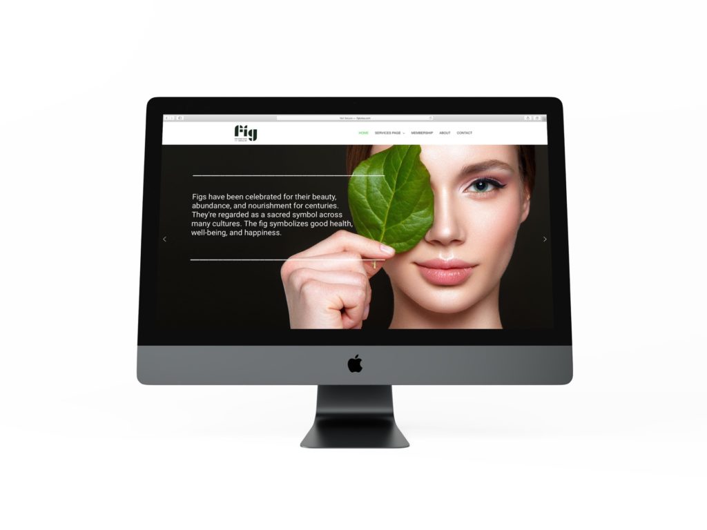
When I finalized the brand identity, I shifted my focus to Fig’s digital presence. A big fear for anyone getting work done is the uncertainty behind it all. It was paramount that their online presence be simple to navigate and the information needed to be simple to understand and digest. This approach would make their clients feel comfortable before they ever walked in through the door.
Simple – as all things should be.
Art Direction & Graphic Design
Valentin Esparza




Responsive
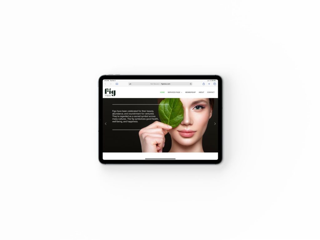
We made sure FIG looks great on any screen.
